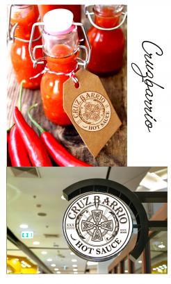
CRUZBARRIO Fermented Hotsauce
Wedstrijd gegevens:
Pakket zilver
- Wedstrijd van: Milosh1981
- Categorie: Logo
- Totaal budget: € 369.00
- Datum start : 19-11-2020 12:14
- Datum einde : 26-11-2020 00:00
- Status : Beëindigd
- Relevante bestanden:
-
Beschikbare talen:


- Aantal inzendingen: 105
-
Respons opdrachtgever:
laag hoog
Behoefte:
LET OP!!!! AANGEPASTE BEHOEFTE
Voor een zelfgemaakte hotsauce met de naam CRUZBARRIO ben ik zoek naar een logo.
Laat je creativiteit de vrije loop. MAAR IN DE HUIDIGE LOGO'S IS HET KRUIS TE PROMINENT AANWEZIG.
Het logo moet passen op een etiket dat plaats zal nemen op bijgevoegde flesjes.
Het etiket moet dan weer bevatten
- naam van de hotsauce
- scherpte
- jaargang
- inhoud
- houdbaarheid
- eventueel omschrijving
Bijgevoegd een voorbeeld van zo'n etiket. Dit mag/kan/moet wel anders.
Bedrijfsomschrijving:
Gefermenteerde HOTSAUCE
Doelgroep:
foodies and spicelovers. People looking for a no additive, clean and healthy product, with a punch in the face.
Kleuren, favoriete logo's, must haves
TrucVanINC
-
-
Toelichting van de designer TrucVanINC:
Dear Milosh!
This is the logo's description:
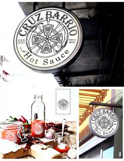
All details of the logo are carefully chosen. They carry special meanings that represent the proper flavours of the Amsterdam brand’s homemade hot sauce.
The Celtic cross is selected and placed in the center of the circle. This is a Latin cross that holds many meanings with one of which being that the 4 branches represent the 4 directions of the Earth, which can translate in 4 elements: Earth, Fire, Water and Air.
There are 9 spikes around the cross turning towards it describing the Dante’s Inferno - 9 circles of Hell for sinners who committed the 7 deadly sins. That comes 7 flavours for the hot sauce.
2 red hot peppers on the left and right sides of the circle are moving clockwise representing the main ingredient of the hot sauce. It also creates a constant 3d circle around the cross and the spikes. The constant moving affect shows the intention of the brand to always keep the flavours original. The continuous circle also means the business will continue to grow smoothly to produce healthier products
The St Andrews’ crosses on the outter left side symbol the Amsterdam Flag - the mother land of company.
The letter C placed at the target of the circle is for the first letter of the brand’s name which is Cruzbarrio, and for the cross Celtic.
Hope this get at your satisfaction!
Thank you for the idea, i have learned new things after this creation.
Best regards!
-
Deze wedstrijd is gesloten. Commentaar geven is niet meer mogelijk.
-
-
-
Toelichting van de designer TrucVanINC:
Hello Milosh,
I’ve been really inspired by the idea to create the logo for your homemade hotsauce.
Please take a look through the following description to get this creative logo’s details meaning.
At the target of the circle, I put the Christian cross named Celtic which features a nimbus or ring that emerged in Ireland, France and Britain in the Early Middle Ages. The Decorative Celtic cross with triquetras that represent the topologically simplest possible knot.
Around the Cross, 9 symbols in form of spearhead turn towards the cross, those represent for the Inferno (Dante’s Inferno) with 9 circles of hell where can find sinners that committed 7 sins.
At the edge of the interior circle, 2 red hot peppers are inserted to link your homemade brand story with the main flavour.
On the left side, I added also the symbol of the Cross Andrew that presents for Amsterdam’s flag, and a little remark of “Amsterdam’s Homemade”.
Hope that you enjoy this presentation. Please do not hesitate to let me know your comments.
-
Milosh1981 zegt :
Really love your story behind it. Do feel that there are details in the logo that could be better and make this a top contender.
- Why are the peppers in that direction
- the spikes look unclean, due to the fact they run through the pepper.
- the font on the word "hot sauce" doesnt fit with the rest of the logo -
Deze wedstrijd is gesloten. Commentaar geven is niet meer mogelijk.
-


