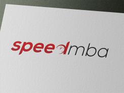
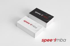
Logo + slide template voor sneltreincursus bedrijfskunde
Wedstrijd gegevens:
Pakket brons
Behoefte:
Het logo moet kracht en bij voorkeur dynamiek uitstralen maar toch strak en zakelijk zijn. Het ontwerp voor slides moet rustig zijn.
Bedrijfsomschrijving:
Het is voor SpeedMBA (www.speedmba.com). Hierop is inhoudelijk meer achtergrond te vinden die clues voor ontwerp kunnen geven. Let echter niet al te veel op het huidige site-ontwerp; hier mag naar hartelust van worden afgeweken.
Doelgroep:
Zie de tab "voor wie" in het hoofdmenu op de site.
Kleuren, favoriete logo's, must haves
Ik houd meestal niet van figuratieve en/of drukke logo's. Een apart logo naast de naam is niet strikt noodzakelijk (ben er wel benieuwd naar); het mag gewoon een naamlogo zijn.
lyra
-
-
Toelichting van de designer lyra:
1a Logo version with different font
-
Machiel zegt :
Hi Lyra, thanks for this one with new font. This one feels a bit too movie style. Plus I'm not wild about the MBA part (in uppercase) being of the same height as the lowercase characters in the speed part. As you can see, I'm not such an easy customer.
Thanks as well for your latest comments. I understand your remarks about the slide template design. Is there a way to get in touch other than here? You could contact me at machiel @ speedmba . com -
lyra zegt
Thanks for the message. You can contact me at [email protected]
I tried to send you and email to [email protected] but it was "rejected by the server for the recipient domain speedmba.com" and returned as undelivered. -
lyra zegt
I tried again twice (now as re: ) but still returns as undelivered. Do you have some other email address?
-
lyra zegt
tried to send you an email again from other email address - the same result
-
Deze wedstrijd is gesloten. Commentaar geven is niet meer mogelijk.
-
-
-
Toelichting van de designer lyra:
Hi Machiel.
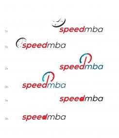
Thank you for your comments and suggestions. (Pity you don't like the last version, I find it successful but, of course, you are the one who decides.) I send you the corrected versions of my three submissions according to your comments:
1a), 1b) more subtle abstract clock version to the left of the logo name;
- font weight "book" (instead of light);
all the letters with sharpened edges
2a), 2b) the arrow head on the "D" removed
2a) font: regular
2b) font: book
all the letters with sharpened edges; mba letters sharpened in different direction
3a), 3b) "D" solidly filled; clock elements in white
3a) font: regular
3b) font: book
all the letters with sharpened edges; mba letters sharpened in different direction
Due to 15-submission (per contest) limit I've placed all the corrected versions in one file so please don't forget to enlarge the image.
Kind regards,
Lyra
-
lyra zegt
ps
the "font" (regular and book) refers to the "mba"-font weight (while the "speed"-font remained bold) -
Machiel zegt :
Hi Lyra, thanks again for all your samples. Although you just served me by following my suggestions, 2a/b and 3a/b have not become the improvement I was hoping for (not your fault, my suggestions just didn't work). I like 1a the best. My suggestion is that you don't put any more effort into it. Situation is that different designers have come up with different ideas / elements, out of which I may make a new whole. From your contributions, I like the clock element most. But another designer already came up with this idea as well (and earlier). I'll have to ask Brandsupply what all of this (selecting elements, designers coming up with the same idea) means in terms of awarding. Another question in this respect is that nobody came up with part 2 of the assignment, being a slide template. I will get in touch with the organization. Best regards, Machiel
-
lyra zegt
Hi Machiel,
Thank you for your message. I am glad you like the first design (at least the image) because I also think that your suggestions for the 2nd and the 3rd version didn't bring an improvement. If you like, I can use some other font (but not one of those used at this contest because it wouldn't be fair with other designers). If you have some font preferences, you can upload the link or examples and make it clear what font style you would like to be used for your logo.
About your idea of combining elements of several designers out of which you wish to make a new whole: sounds interesting :) but unfortunately, you can only choose one winner per contest, whatever design it is; or, if your requirements are not fulfilled at the end of a contest, it will end without a winner.
About: "nobody came up with part 2 of the assignment":
Honestly, (my fault) I myself haven't noticed the title (mentioning the slide template) until yesterday because the category of your contest is marked as "logo design" which always refers to logo design only; moreover, the budget attached falls into a moderate category for a logo design (only). It is still not clear to me what the scope of this project is because your brief doesn't say anything about the number of slides, content (text, graphics,...), etc.
Best regards,
Lyra
-
Deze wedstrijd is gesloten. Commentaar geven is niet meer mogelijk.
-
-
-
Toelichting van de designer lyra:
Here is a new proposal with an abstract image of a clock - similar to a speed meter. The clock hands set to nine o'clock can also be seen as a slit that, along with the time of the beginning of the course, symbolizes an open space.
-
Machiel zegt :
Hi Lyra, this one is to my eyes unfortunately not an improvement: not wild about the font, and the clock is a bit too comic style. Perhaps a more subtle abstract version to the left of the name logo?
-
Deze wedstrijd is gesloten. Commentaar geven is niet meer mogelijk.
-
-
-
Toelichting van de designer lyra:
A new proposal based on the same "D-concept" (described below, now with a speed meter image. Your feedback in Dutch or English is welcome. (Please don't forget to enlarge the image to see the actual colors.)
-
Machiel zegt :
Hi Lyra, after the feedback I gave a minute ago, I saw your new contributions. This one here is a little bit too "gimmicky", but this might already be solved by removing the arrow head on the D (the arrow head makes the idea less subtle). Best regards, Machiel
-
Deze wedstrijd is gesloten. Commentaar geven is niet meer mogelijk.
-
-
-
Toelichting van de designer lyra:
the same logo (presentation) but without the black layer behind the red ("speed") layer
-
lyra zegt
Your feedback (in Dutch or English) is welcome.
-
Machiel zegt :
Hi Lyra, thanks for your contribution, and apologies for late reply. The font is promising, but I find myself having trouble with a lack of consistency in it: the P and D have sharpened edges (as have the M/B/A), but the S and E don't. Another thing is that the MBA part may be too subtle in relation to the speed part.
About the clock in the D: again this is promising, but I'm not keen on how this "erases" the D. Could it be an option to have the D solidly filled, and have the clock elements in white? Best regards, Machiel -
Deze wedstrijd is gesloten. Commentaar geven is niet meer mogelijk.
-
-
-
Toelichting van de designer lyra:
Here is my concept for your logo. It is clean, simple and suitable for any medium, for web and for print. The clock is subtle incorporated in the text. Why in the "d"? It stands for
- a "day" ("In één dag klaar")
- development ("training/workshop op het gebied van New Business Development")
- thinking/denken ("bedrijfskundig denken")
The "speed" component is emphasized by the use of red gradient and sharpened edges of the characters/image. The slight shearing of the characters/image toward the right gives the whole a dynamic feeling.
The black layer behind the red ("speed")layer is optional. Design elements (colors, fonts, etc.) can be changed according to your preference. Looking forward to your thoughts on this design.
Kind regards -
Deze wedstrijd is gesloten. Commentaar geven is niet meer mogelijk.
-


