Redesign of the logo Milkiland. See the logo www.milkiland.nl
Wedstrijd gegevens:
Pakket goud
Behoefte:
1) create a new logo Milkiland for use it as a product brand for Premium semi-hard cheese and cream-cheese, cottage cheese, butter, whole milk products, dry milk products.
2) the only constant thing to keep from the current corporate logo is the word Milkiland. All the other elements of the current logo including colour, font, etc., could be changed or removed
3) the logo should have a simple outline, shape to place it against any background of the package
4) the colors could be blue, green, white, red or any other natural colors to support the idea of dairy products
Why do we need that?
1 The corporate logo Milkiland does not fit for sales of European cheese on the markets of Ukraine, Russia, Asia and other countries.
2 It doesn’t correspond the meaning of cheese or dairy products from the Western Europe. Dutch origin is especially valuable
3 We need to compete with a German brand Hochland (Hochland Kaasland)on the Ukrainian, Russian and other Eastern markets.
4 We can compete if we have a rather Dutch name and image of the brand
The other Competitors:
Arla, Milkana, Valio, Bel, President (Lactalis), Milchland
Bedrijfsomschrijving:
Doelgroep:
Kleuren, favoriete logo's, must haves
pcvdgroen
-
-
Toelichting van de designer pcvdgroen:
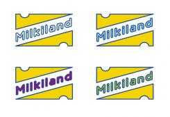
Hello Yevgen, here's another try. Needs still some work.
Thanx, Paul. -
Yevhen zegt :
Do not be so minimalistic please
-
Deze wedstrijd is gesloten. Commentaar geven is niet meer mogelijk.
-
-
-
Toelichting van de designer pcvdgroen:
Hello Yevhen,
my russian is a bit rusty so I prefer to write in english.
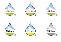
Here're some new examples of the logo. I stylised the dutch flat landscape, with a white cloud, the name in dark type and some tests with colour. Hopefuly we can work further from the ideas as shown. If we use red and dark blue it will quickly look like a Pepsi logo instead of milk. I still the droplet to indicate the origin of cheese which is milk (moloko I now remeber!). But as you said, if your core business is cheese, we shoul consider yellow(s) as the main colour?
Bye, Paul.
-
Yevhen zegt :
Hello Paul,
thanks a lot, moloko is a right word. In Ukrainian and Russian it is the same. We do not have to use it now of cause.
We have it used in the other project. See the logo at http://www.moloko-kraina.com.ua/en/
It was created 2-3 years ago by Dutch guy. It was "redesignme" community.
About your logo.
Cheese is our prime product. What you have done is rather milky.
That milk drop shape is rather unstable.
Cheese is stable, mature.
Please try to rework the shape of it.
Bye,
Yevhen
-
Deze wedstrijd is gesloten. Commentaar geven is niet meer mogelijk.
-
-
-
Toelichting van de designer pcvdgroen:
Hello there!
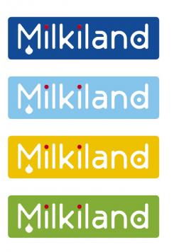
Here's my first sketch of a new logo for Milkiland.
Colours are to be detailed later on, so for now I focused on the name and your other wishes compared with the competition in the rest of the EU. I avoided using red white and blue since those colours are also in the russian flag, and not that loved in the Ukraine. I did not use an image for Asiatic countries could be of islamic beliefs.
Looking forward hearing form you, cheers,
Paul van der Groen
www.pcvdg.com
-
Yevhen zegt :
Thank you Paul,
The version is interesting. You've caught the idea of milk. Ok. You've been absolutely right when you put the word Milkiland into the "box". We need to have simple outline of the logo to use it against the different backgrounds.
I'm not sure that having the word "Milkiland" written in white is very good. We'd rather have it dark (blue or other) against the white background.
Although I do not want to limit the range of ideas. Every fresh view is valuable.
Some more comments.
Our main product for the brand is cheese. We are not so much milky we are rather cheesy for more than the half.
The Russian flag's colours are not good conbination for sure. We do not want to have much red, but could have it slightly or do not have at all.
Our main competitor at the segmnet Hochland has a red outline in the logo.
You could use traditional Dutch colours, if not red or some red.
You could also try to express the idea of land using the sketch of land, valley, sky
Thanks a lot. I hope to see your futher ideas.
Yevhen -
pcvdgroen zegt
Hello Yevhen,
Are you of russian birth? Kak dela? I studied russian for a year, so ;-)
I will design a dutch landscape en have the logo in white plus more emphesis on chess production. Da swidanja!
Paul. -
Yevhen zegt :
Hi Paul,
I'm Ukranian, born in the USSR (Russian Empire which I hope is going to die). I speak Ukrainian as well as Russian. If you find it's better to write you in Russian I could do it easily.
Looking forward to see more of your ideas.
Best wishes,
Yevhen -
Deze wedstrijd is gesloten. Commentaar geven is niet meer mogelijk.
-


